Statistical Presentation - have numbers help your case
This campaign tip (no. 8) was published on Tuesday, 8th January 2019
OK - so if I had taken one different course module I would be a Statistician not a Computer Science expert - this is my sort of stuff. There is scope to mislead, and also scope to learn from data.
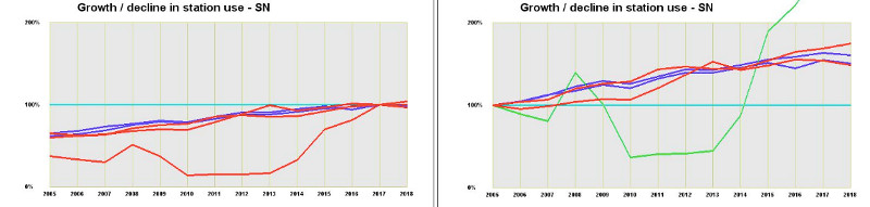
Careful presentation of data adds power to your story - but understand your data and be aware of what else it's telling you.
The two graphs at the top of this page are showing the same data through the same piece of software. It's ticketed passenger journey growth / shrinkage at stations in the SN postcode area - 2005 to 2018. The only difference in my input was that for the left hand graph, I normalised the data to 2018 and on the right hand graph to 2005.
• The left hand graph appears to show one station - that's Melksham - performing way below par, but coming up to something like standard in the last year or two.
• The right hand graph appears to show major problems at Melksham from around 2010 to around 2013 which have now come right, and more than right as it has overtaken stations such as Swindon, Chippenham, Kemble and Pewsey which also have SN postcodes.
• In my view, though, neither of the apparent conclusions is correct.
Take a look at this table ... an alternative presentation of much of the data:
• it shows the astonishing growth at Melksham (over 19 TIMES the traffic in 19 years!) but • it also shows that the passenger number at Melksham are still pathetic - with under 3 journeys per head of population in 2018, as compared to between 19 and 50 for other stations in the comparison group.
So to inform the campaign ...
• The wide team who have contributed at Melksham have made a massive difference
• They still have a long way to go and a lot of work to do
• Where we have 75,000 journeys last year, we should work for 350,000 in the next decade.
Or as I wrote in the New Year (2019) when asked for predictions:
Discussion via Coffee Shop forum
Careful presentation of data adds power to your story - but understand your data and be aware of what else it's telling you.
The two graphs at the top of this page are showing the same data through the same piece of software. It's ticketed passenger journey growth / shrinkage at stations in the SN postcode area - 2005 to 2018. The only difference in my input was that for the left hand graph, I normalised the data to 2018 and on the right hand graph to 2005.
• The left hand graph appears to show one station - that's Melksham - performing way below par, but coming up to something like standard in the last year or two.
• The right hand graph appears to show major problems at Melksham from around 2010 to around 2013 which have now come right, and more than right as it has overtaken stations such as Swindon, Chippenham, Kemble and Pewsey which also have SN postcodes.
• In my view, though, neither of the apparent conclusions is correct.
Take a look at this table ... an alternative presentation of much of the data:
| Town | 1997/8 | 2017/8 | Population | Growth | journey per person |
| journeys | journeys | 2018 (est) | 1998-2018 | per annum, 2018 | |
| Melksham | 3868 | 74220 | 28000 | 19.18 | 2.65 |
| Warminster | 206409 | 365892 | 19000 | 1.77 | 19.25 |
| Trowbridge | 341475 | 930134 | 37000 | 2.72 | 25.13 |
| Westbury | 227932 | 569372 | 19000 | 2.50 | 29.96 |
| Chippenham | 945435 | 1890096 | 48000 | 2.00 | 39.37 |
| Bradford-on-Avon | 187957 | 525968 | 11000 | 2.80 | 47.81 |
• it shows the astonishing growth at Melksham (over 19 TIMES the traffic in 19 years!) but • it also shows that the passenger number at Melksham are still pathetic - with under 3 journeys per head of population in 2018, as compared to between 19 and 50 for other stations in the comparison group.
So to inform the campaign ...
• The wide team who have contributed at Melksham have made a massive difference
• They still have a long way to go and a lot of work to do
• Where we have 75,000 journeys last year, we should work for 350,000 in the next decade.
Or as I wrote in the New Year (2019) when asked for predictions:
| Melksham hat on. I look forward - with some degree of hope - to a much higher percentage of trains running to the timetable published twice a year. And to those trains running within 10 minutes of their scheduled time, and with sufficient capacity not to put people off. So much work was done in 2018 to bring that optimism. With good continued marketing and promotion - and there are different mainsprings on that bow this year - passenger numbers should start to blossom again. For the year to March 2019, ORR data to be published in December will still be muted by the massive service losses from the annual timetable during 2018, but for the year to March 2020, and the ORR publication in December 2020, we could break the 100,000 barrier. |
Discussion via Coffee Shop forum